DEFINING THE PROBLEM
Outdated information
The stock chart does not reflect the classification data in the app
Clustered Information
A portfolio card has clustered information and it’s difficult for users to view the portfolio status
Missing valuable metrics
Unique metrics that can help users gain an overview of the portfolio status are missing
Current state
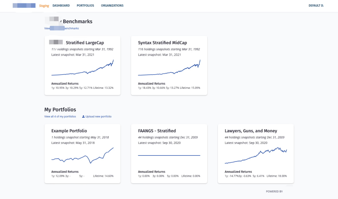
Image: Original dashboard design
What is an investment portfolio?
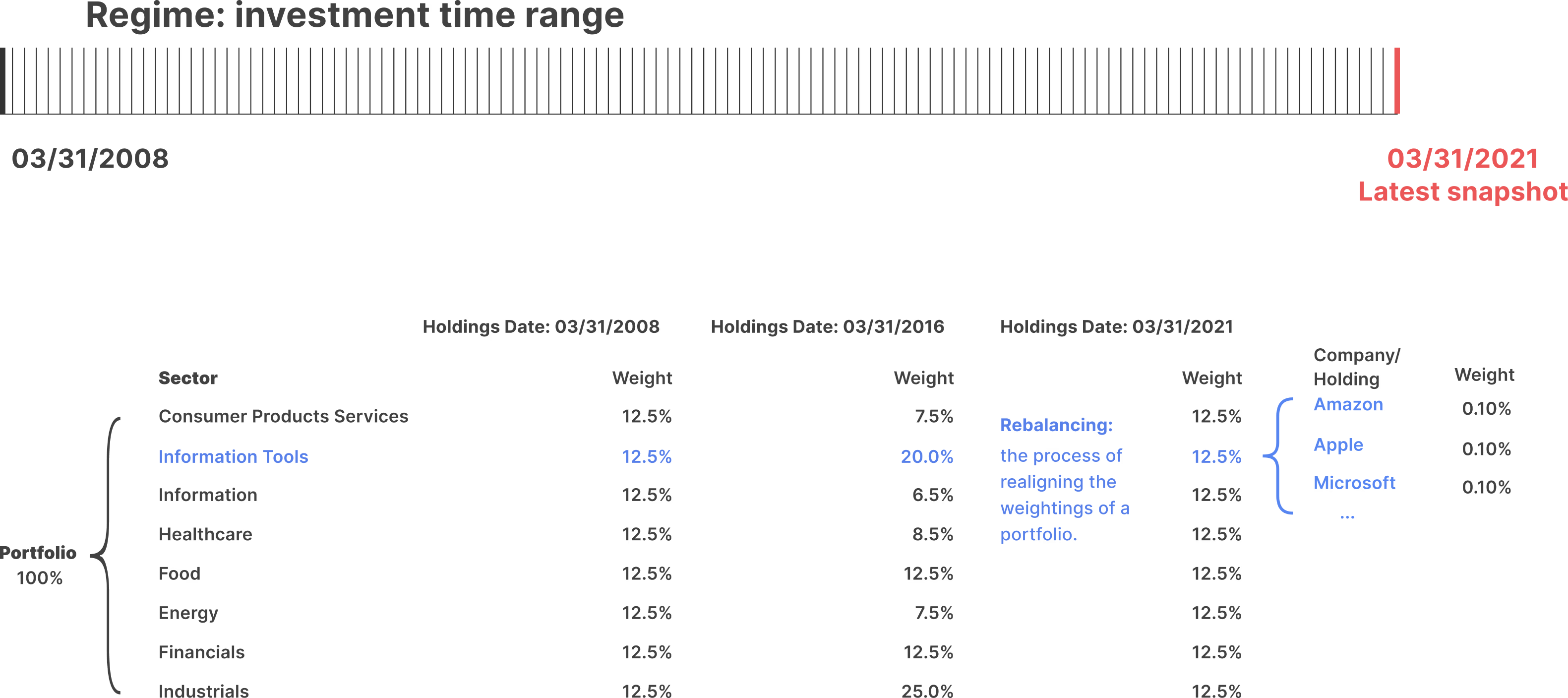
Portfolio status that users care about the most:
1.Active business risk
A calculation shows how far the current portfolio is from the ideal portfolio, which has equal weights in each sector.
If the ABR is high, the portfolio is overexposed or underexposured to certain sectors and at risk.
2.Sector exposures on the latest holdings date
A calculation that measures the portfolio exposures in different sectors on the latest holdings date.
3.Number of holdings in a portfolio on the latest holdings date
OPPORTUNITIES
Opportunities
Opportunities for primary users
Portfolio managers and financial analysts in our partner org.
Background: They are the stakeholders of the app who send different feature requests to my team, so that we can build out a tool for them to manage large-scale portfolios.
Pain Points: (Functionality) Cannot directly upload and build portfolios on the dashboard(Design) Cannot have a general understanding of portfolio status.
Need: Gain an overview of all portfolio status
Upload and build portfolios
Edit portfolios and filter portfolios by an organization or by benchmarks
Easily access to portfolios and holdings of a portfolio
Opportunities for new users
Portfolio managers in other wealth management firms.
Background:
Have experience in using different financial analytics tools to construct portfolios
Are attracted to the patented classification data in the app
Needs:
An overview of the all portfolio status
A similar experience as other financial analysis tools to reduce the learning time of a new app
Vision
Our vision is to create a seamless, intuitive dashboard that provides both new and existing users with a clear, comprehensive overview of their portfolio status.
Design Iterations
Iteration 1: dashboard
How might we design a dashboard that allows users to quickly understand their portfolio status?
Pros:
1. Structured Layout: The use of tables and clear headings (e.g., "My Portfolios," "My Org Portfolios," "Benchmarks") provides a logical and organized structure, making it easier for users to navigate the information.
2. Data Visualization: The inclusion of percentages and sector exposures in tables allows for quick scanning and comparison of key metrics like "Active Business Risk" and "Top Sector Exposures."
Cons:
1.Lack of Visual Hierarchy: The design relies heavily on text and tables, which can feel monotonous. Adding visual elements like charts, graphs, or icons could make the data more engaging and easier to interpret at a glance.
2. Overwhelming Text: The heavy reliance on text and numbers without visual breaks can overwhelm users, especially those unfamiliar with the data.
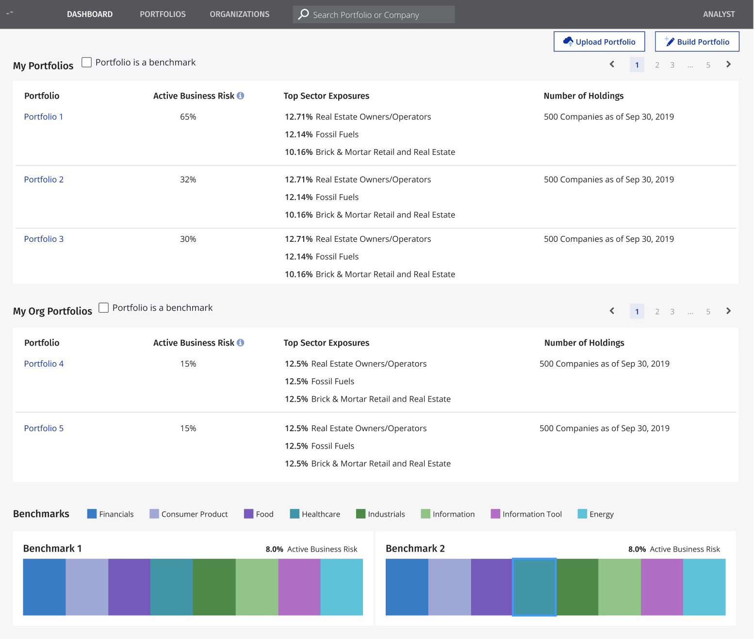
Iteration 2: dashboard
Pros:
1. Consistent Data Presentation: Each portfolio and benchmark follows a consistent format, displaying key details like "TOP SECTOR EXPOSURES" and "ACTIVE BUSINESS RISK," which aids in quick comparison.
2.Benchmark Comparison: The inclusion of benchmarks provides context for evaluating portfolio performance, which is useful for decision-making.
Cons:
1.No Color Coding: The absence of color coding or visual cues (e.g., green for low risk, red for high risk) makes it harder to quickly assess key metrics like "ACTIVE BUSINESS RISK."
2.Lack of Visual Hierarchy: The design relies heavily on text, which can feel monotonous. Adding visual elements like charts, graphs, or icons could make the data more engaging and easier to interpret at a glance.
Iteration 3:
sector exposure
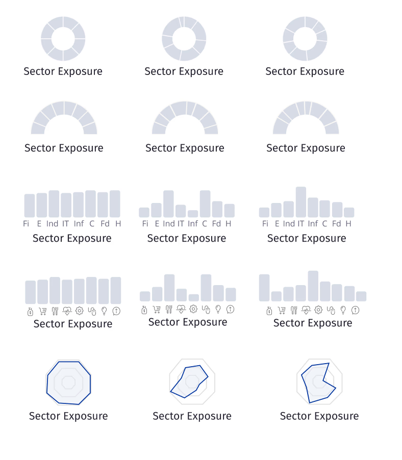
sector exposure
Pros:
1.Clear Data Representation: The hexagon design can incorporate visual elements like color coding, gradients, or icons to represent different sectors, making it easier for users to interpret the data at a glance.
2.Interaction potential: Hexagons can be designed to be interactive, allowing users to hover over each sector to reveal more detailed information.
Cons (other design proposals)
1.Lack of Clarity: The repeated use of abbreviations (Fi, E, Ind, IT, Inf, C, Fd, H) without any explanation or legend makes it difficult for users to understand what each abbreviation stands for, especially for those unfamiliar with the terminology.
2.Poor Use of Space: The repetitive nature of the content wastes valuable screen space that could be used to provide more detailed or varied information.
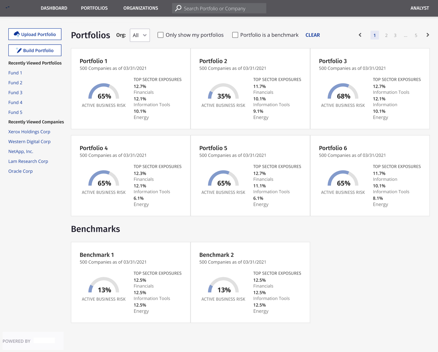
Iteration 4:
active business risk
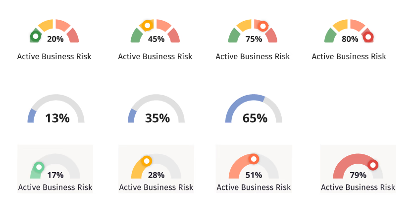
active business risk
Pros:
1.Minimalist Design: the simplicity of the design avoids unnecessary clutter, making it easy for users to focus on the key data points.
2.Focused Presentation: The last row condenses the key information (e.g., percentages like 13%, 35%, 65%) into a more compact format, making it easier for users to quickly grasp the data without unnecessary repetition.
Cons
1.Color usage: no color variations to indicate the risk status.
FINAL DESIGN
Final design
User-Centric Design: Personalized greetings and easy access to recently viewed items enhance engagement and satisfaction.
Efficiency and Usability: Search functionality, filters, and clear labels streamline navigation, saving time for users.
Comprehensive Overview: Key metrics like "Active Business Risk" and "Sector Exposure" provide quick yet detailed insights.
Flexibility and Control: Options to build, upload, and filter portfolios cater to diverse user needs and preferences.
Scalability and Consistency: The minimalist, consistent design supports growing datasets while maintaining clarity.
Take aways
Take aways
Thrive in ambiguity
From this project, I learned how to rephrase the problem and frame the scope through research and evaluation. Going wide and then narrowing down, I explored varied forms of touchpoints and actions before moving straight to the design details. Where the challenge is vague, there are more opportunities and surprises await! An ambiguous situation gives me as a designer the chance to find my own voice and direction through user research.
Think beyond a designer’s role
Collaborating in an interdisciplinary environment, I learned that a well-operated product is more than its interfaces or interactions—it requires a whole team’s effort both at the frontstage & backstage. As a designer, I collaborated with other teams where I applied very different perspectives that I learned from them. I learned that it’s important to retain flexibility while still keeping my expertise. I’m excited to wear more different hats in the future!
Other case studies
GenAI-driven workflows
UX Design, Case Study
Case management in AC3
UX Design, Case Study
Website Redesign
Website Redesign, branding
Role
Lead designer
Duration
April 2021 - June 2021
Team
1 UX designer, 2 PMs, 1 tech team
Tools
Figma
Overview
Affinity is a financial analytics tool provides patented classification data for portfolio managers and financial analysts to assess and control complex risks in large-scale investment portfolios. However, was facing usability issues that led to a decline in user satisfaction and engagement.
Our goal was to redesign the dashboard, improving its UX/UI to provide a seamless, intuitive, and enjoyable experience for users, ultimately increasing user retention and satisfaction.
Our goal was to redesign the dashboard, improving its UX/UI to provide a seamless, intuitive, and enjoyable experience for users, ultimately increasing user retention and satisfaction.